Suggested time spent on this section: 25 minutes
We may now combine our separate strokes into letters, though each stroke should still be made individually, lifting the nib between them. Move your whole hand and arm as needed, rather than relying only on your wrist and fingers.
Lowercase letters sit on the baseline, the lower of the two central horizontal guides, and are formed between this and the waistline above. Ascenders rise above the waistline, as in b, d, f, h, k, l and t; descenders fall below the baseline, as in g, j, p, q, y and z.
The arrows show the direction and order of each stroke. Remember to use slightly more pressure on downward strokes and a lighter touch on upward strokes to create the contrast between thick and fine lines.
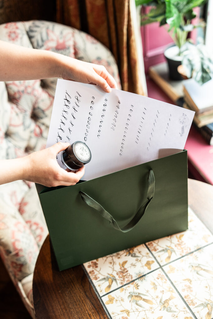
Trace the pale grey examples, then try a few freehand. Continue in black ink for now. Once you have practised each letter a few times we shall move on to coloured inks and capitals.
Further letters are demonstrated in the videos below.
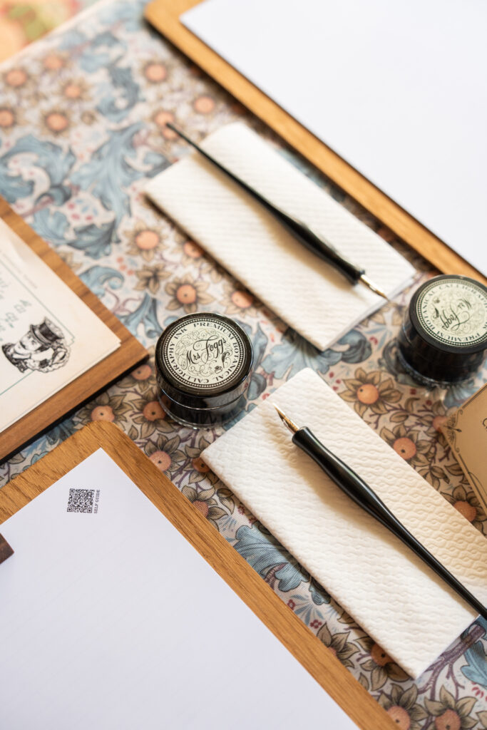
A small tip from the atelier: the tines of the nib are quite sharp, and may occasionally catch on the paper fibres. Should this happen, simply wipe the nib clean with the cloth provided, reload it with ink, and continue.